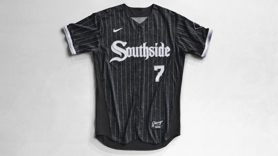
The new Nike 2021 City Connect jersey for the Chicago White Sox
The Chicago White Sox have a surprisingly colorful logo and uniform history, as the team spent most of its existence in the 20th century hopping around from identity to identity without a real consistent look to stay with for a very long time. That changed in 1990, when the White Sox rebranded and went with an identity that they’ve stuck with for more than thirty seasons now. The simple black-and-white look with the classic interlocking “Sox” logo struck a chord not just with baseball fans and uniform enthusiasts but on a deeper cultural level as well. The black-and-white design became truly synonymous with Chicago’s South Side and its staying power is testament to that.
Knowing that the color scheme and general design aesthetic is already an iconic enough base, it’s not a particularly big shock to see that Nike’s City Connect design for the White Sox has used the black-and-white color scheme as a foundation for what they wanted to do with this new special alternate uniform. However, the City Connect uniforms have already established a reputation for pushing the limits of conventional wisdom when it comes to MLB uniform design and we’ve got plenty of examples on display with this particular uniform.
The most interesting thing on display here is that the team is wearing black from head-to-toe. While the White Sox are in fact no strangers to wearing dark-colored uniforms with pinstripes, it’s a look that we haven’t seen from Chicago’s South Side squad since 1925 and it’s still a look that is jarring to see on a modern-day MLB diamond. Even the bold-looking City Connect uniforms for the Miami Marlins stuck with traditional white pants, so the usage of black pants for the White Sox is radical in and of itself. Additionally, the “Southside” script graphic across the chest is new since it’s not the actual city name. With that being said, it still makes sense for the White Sox to go with that name across the chest since the team is proud of the fact that they call the South Side of Chicago in particular their home.
The font choice is also very intriguing and that extends to the cap logo as well. The iconic White Sox hat that we’re used to seeing has been remixed a bit — after all, it would’ve been a little too dull if they made these changes and stuck with the same cap. Still, the Old English “CHI” logo serves as a pretty solid stand-in and the White Sox logo has some sort of representation in the form of the “Southside” script logo, as the S in “Southside” is very similar to the Gothic-style “S” that you’ll see in the primary logo. That serves as the basis for the numbering font, which is a custom font specific to this uniform.
Overall, it’s a look that is very fitting for the White Sox while also managing to serve its main purpose of being very distinctive when compared to the normal uniforms that the Sox wear. The fan reaction to these uniforms appears to be mostly positive as well, which isn’t surprising considering that it’s a look that is dedicated to the specific part of the city that the White Sox play in.
However, the main quibble that I could see people having with this uniform is that “South Side” was merged into one word instead of being two words. That space could understandably be the difference between a heartfelt tribute to some fans and coming off as inauthentic to other fans. Also, while these uniforms may have been in the works for a long time, it’ll definitely be worth the price of admission just to get a look at old-school White Sox manager Tony La Russa wearing these “new-school mentality” uniforms that were just unveiled. It’s a clash of styles, indeed.
As far as the future of Nike’s City Connect series goes, this has served as a bit of a checkpoint for the rest of the teams. We’ve seen one team just completely break out a brand new color scheme while another team used their current color scheme in a completely different way. This time, we saw a team once again stick to their usual color scheme but this time, they added to that by switching things up with the chest logo and the design of the pants as well. That’s an indication that there’s really no limits to what’s possible with this City Connect series.
We could see the next few teams stick to what we’re used to seeing from them, or we could see something that’s on a completely different level. It’s exciting to see and there’s going to be plenty of anticipation to see what’s in store for the White Sox’s neighbors on the North Side as the Cubs unveil their City Connect uniforms next month. For now, the spotlight is solely on the South Side.