Gold bars
The best thing about just following the action of price charts is that you don’t have to worry too much about all of the macro stories that get told. It frees you of coming up with reasons for ups and downs. Will inflation come back strong? Will cyrptocurrencies collapse completely? Will China invade Taiwan?
The way precious metals trade tell you all you need to know, basically. Nothing’s changed, really, with this original fear gauge. Generally, if the price of gold and silver are headed down, investor concern about macro stories is toned down. If the prices are rising, something’s troubling about the larger picture.
That’s why, right now, it’s fascinating to see the indications of a bottoming process in these markets, especially among the equities in the sector.
First, here’s the gold price chart:
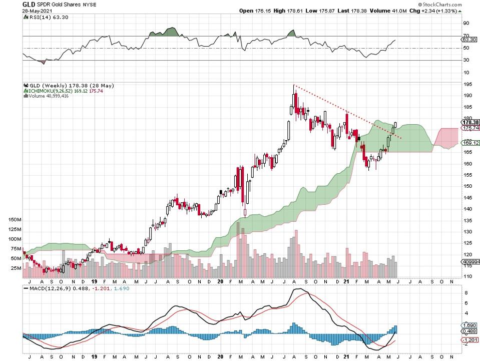
SPDR Gold Shares weekly price chart, 5 31 21.
You can see how the price recently broke back above the downtrend line that connects the summertime peak with the January, 2021 high. Gold is now trading back above the Ichimoku cloud, a positive sign. Note, also, below the price chart, that the moving average convergence/divergence inicator (MACD) is trending upward again.
Here’s the silver price chart:
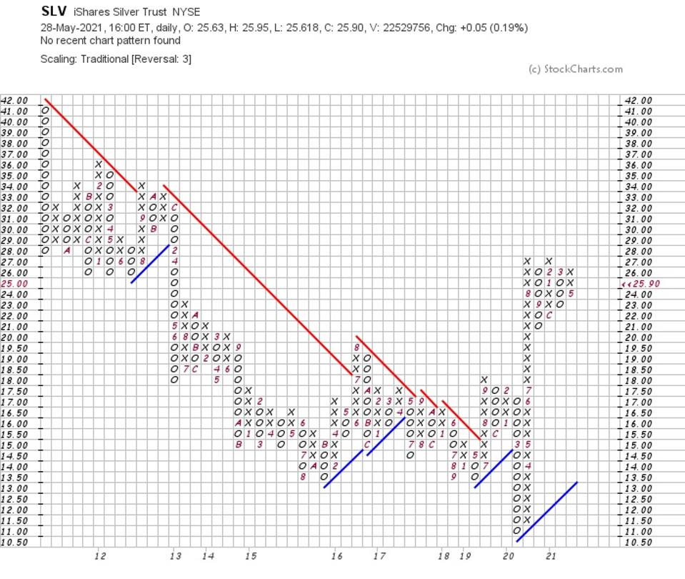
iShare Silver Trust weekly price chart, 5 31 21.
The classic-style point-and-figure chart delivers the best picture for silver. Basically, the price is trending upward and has been since early 2020. It’s clear that sellers come into the market at 27. If that level is taken out when enough buyers return, the metal could take off.
Here’s how 2 stocks in the sector are performing lately. The first is the Hecla Mining
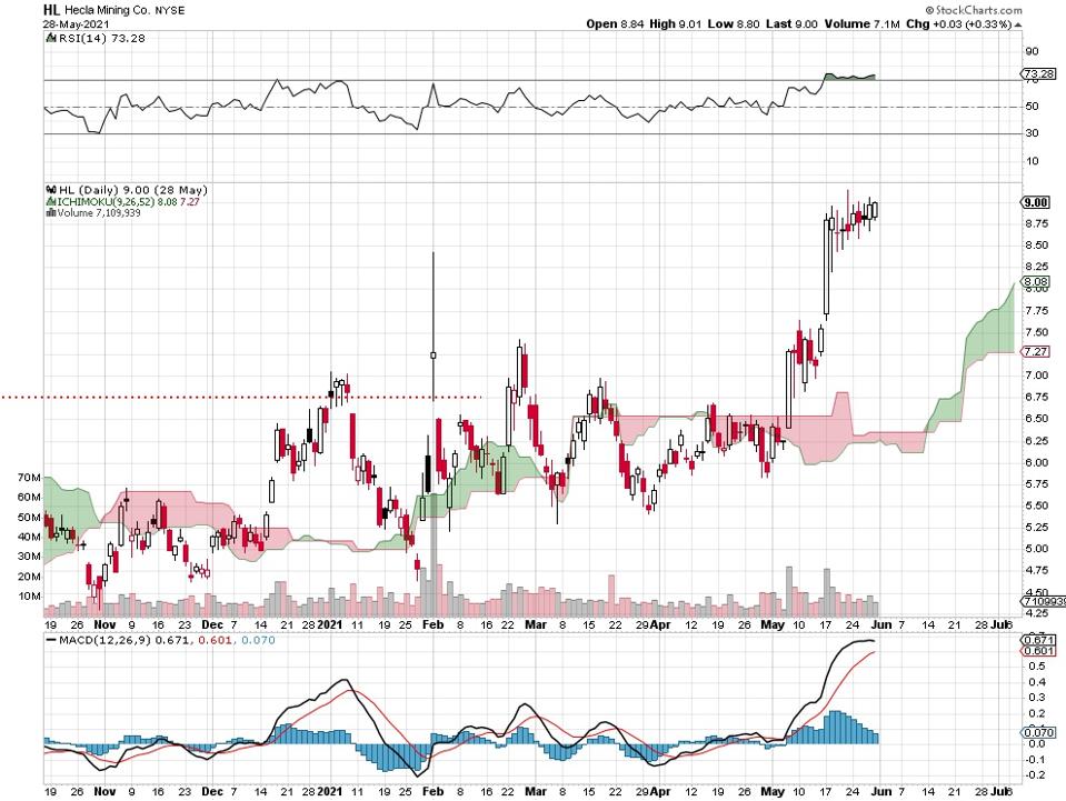
Hecla Mining daily price chart, 5 31 21.
The New York Stock Exchange traded gold and silver producer managed to blast above that unusual February high. That’s when a few traders apparently organized on internet forums to attempt a short squeeze. It worked temporarily. Now, months later that old high has been taken out. Buyers seem to be back in charge with no short squeeze necessary this time around.
The Wheaton Precious Metals daily price chart looks like this:
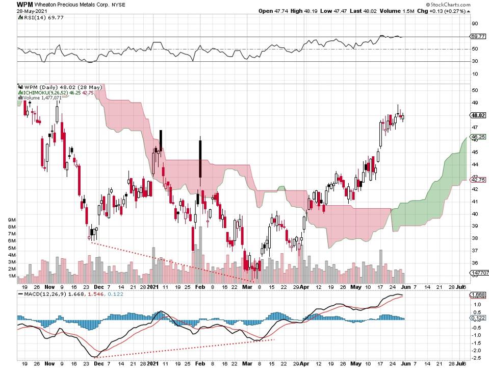
Wheaton Precious Metals daily price chart, 5 31 21.
This Canadian-based gold and silver mining company is also NYSE-traded. You can see how the price is now above the February squeeze and has taken out the earlier January high as well. Look at the positive divergence showing on the MACD indicator (below the price chart) and the 2 price lows of November, 2020 and March, 2021.
One more chart, please. This one’s the daily VanEck Vectors Gold Miners ETF:
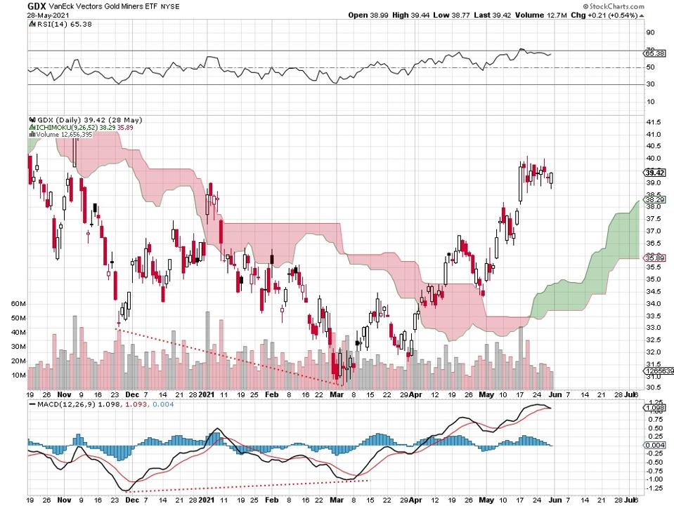
VanEck Vectors Gold Miners ETF daily price chart, 5 31 21.
This shows the direction of a group of listed gold mining stocks. You get a picture of the sector as a whole. The main thing is the positive tone of the moving average convergence/divergence indicator (MACD) show below the price chart. This, combined with the movement of the ETF to above the Ichimoku cloud suggests that precious metals miners may have turned a corner.
If true, this indicates that fear of some kind is returning as a serious macro factor. What kind of fear I leave to macro experts.