Woman Kissing Dice
You read on an Internet stock market forum that everyone there is making a fortune on short squeezes. They’re finding high short interest stocks and buying them like mad until those short are forced to cover by buying shares back. So, you join in and buy — except it’s too late, all the shorts have covered and the price has collapsed.
Can you get out before the crowd starts dumping? What will you do if the powers that be stop trading in the stock because of “volatility” and you’re trapped until it opens again at 80% less?
Why not just go out to Las Vegas and stand at any one of several decent craps tables that the city offers? Your chances of profiting are about the same and besides, the casinos will provide you with free drinks while you crap shoot. The New York Stock Exchange does not offer free drinks last I checked. Not on the floor anyway.
Here are the hourly and daily price charts of 2 of the most watched “short squeeze” situations, both of them NYSE traded. While it’s impossible to predict what might happen, it’s relatively easy to identify trend and to find support and resistance levels even with the increased volatility.
The AMC hourly price chart looks like this now:
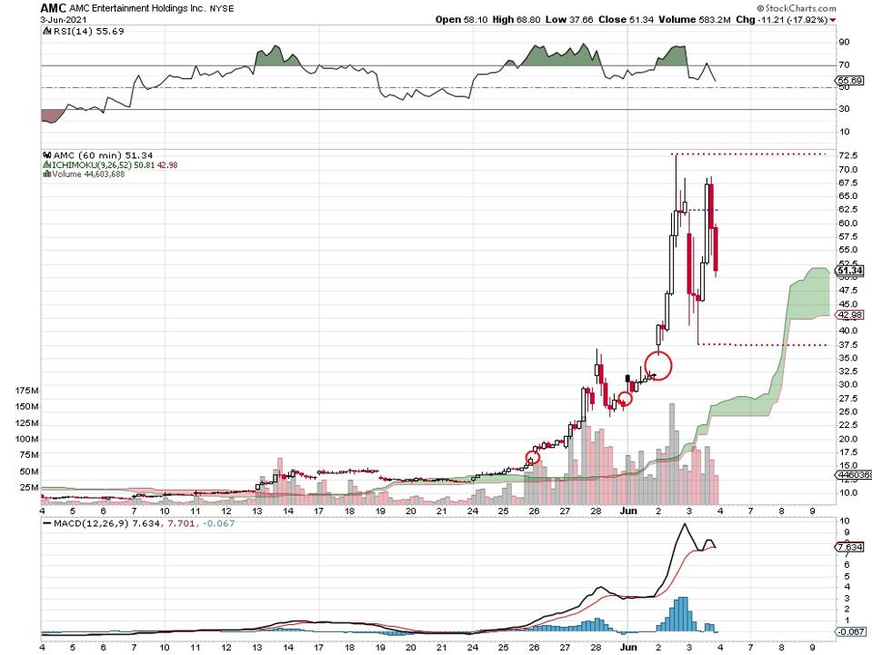
AMC hourly price chart, 6 3 21.
Today’s action failed to take the price higher than the previous peak up near 72.5. After tanking all the way down to 37.50 in the morning, buyers moved in. They took AMC back up to about 68 before another bout of selling came in and the stock closed at 51.34.
So, the trading range is from 72.5 to 37.5 all in one session. Does it need to be said how unusual this is for an NYSE equity? This is how penny stocks used to trade but these are actual dollar figures, not pennies.
Here’s the AMC daily price chart:
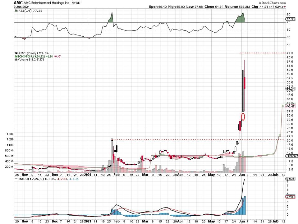
AMC daily price chart, 6 3 21.
You can see how the stock last month broke above the January high of about 20. That straight up quality begins to accelerate this month and here we are. You don’t often see a daily price range of 20 to 72.5 in just 2 months time. This is a phenomenal short squeeze even though the June volume levels have yet to exceed the late January blast upward.
The Gamestop hourly price chart looks like this:
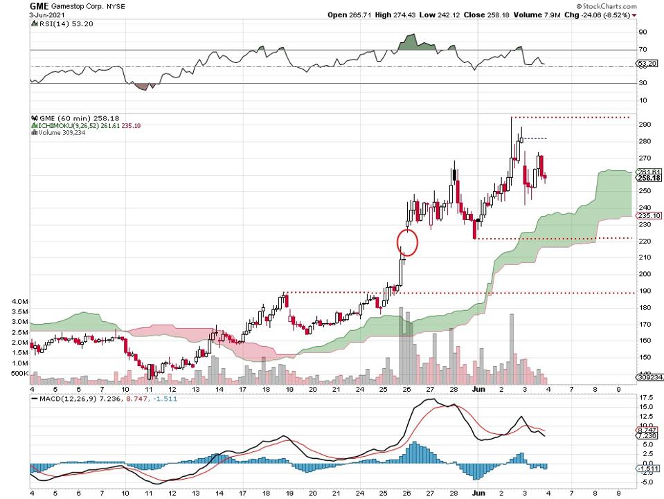
Gamestop hourly price chart, 6 3 21.
The main thing here is the negative divergence in the moving average convergence/divergence indicator (MACD) below the price chart. Although today’s peak is higher than the most recent, earlier peak — MACD is lower. The red dotted lines indicate potential support and resistance levels. Note that volume seems to have picked up dramatically from early to mid-May.
Here’s Gamestop’s daily price chart:
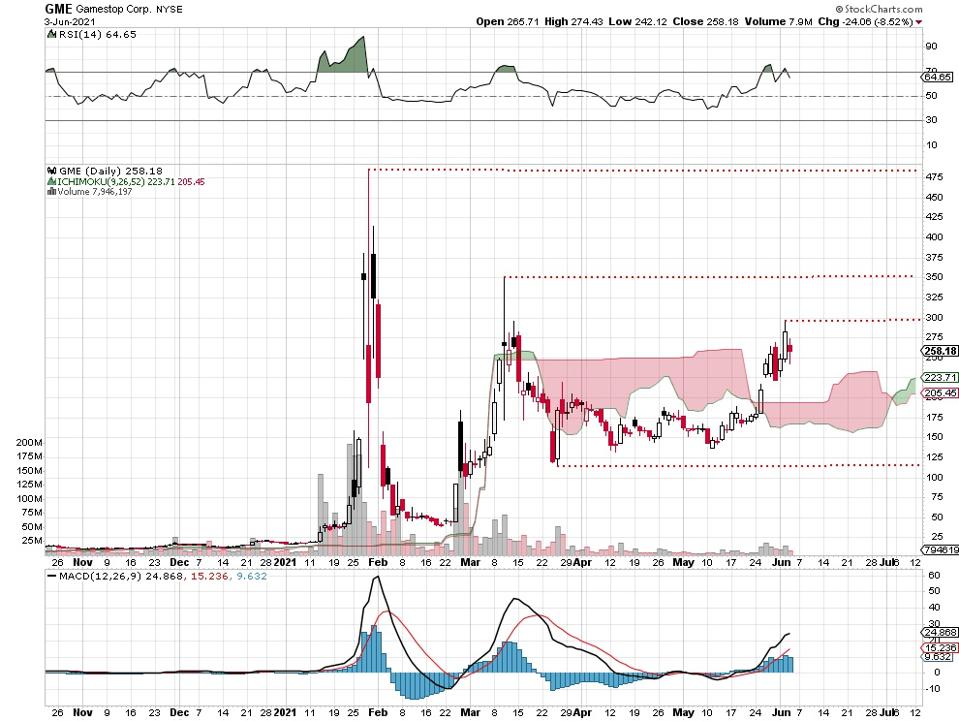
Gamestop daily price chart, 6 3 21.
Much different than the AMC chart look, this short squeezed stock is progressively less squeezed. Today’s peak of about 300 is less than the March high of 350 and much less than the January peak up there just past 475. You can make out how the levels of volume have greatly decreased since earlier in the year. Gamestop’s possible resistance and support levels are indicated by the red dotted lines.
This battle is between funds that short stocks and Internet forum groups that find those heavily shorted stocks and attempt to squeeze them. And anyone else who wants to join in. It’s a new phenomenon now affecting more names and bigger names and likely attracting the attention of regulators.